Data for Everyone: Making Visualizations Clear, Simple, and Understandable
You’ve spent months gathering data, running tests, and putting together what you think is a brilliant scientific graphic. You show it to your colleagues, expecting praise. Instead, you get the dreaded squint and head tilt. That universal look that says, “I don’t get it, but I won’t say anything.” I’ve both received and given that look countless times in my career!
This is a common problem in today’s data visualization world. Smart people make beautiful but confusing charts that leave readers lost. These aren’t just bad visuals; they stop communication, turn people off, and make the information harder to access, all while using lots of colors and fancy fonts.

The Real Tragedy?
Behind most confusing charts is valuable, fascinating data that could genuinely help people. But instead of building a bridge between research and reality, these visualizations create walls, which ultimately lock insights behind jargon and complexity.
The Sophistication Scam
Academic and industrial culture tells us that complex = smart. This is not true. Real sophistication means making complex things simple to understand.
Whenever I’m explaining something complicated, I ask myself: “Could a 6th grader (or even a 3rd grader) understand this?”
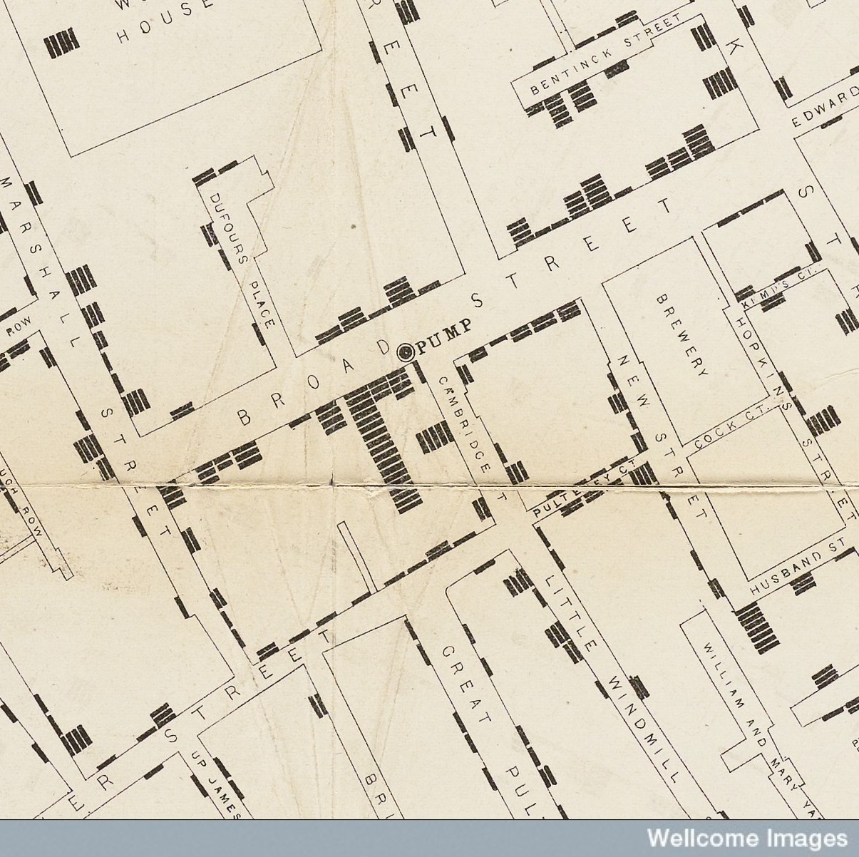
One of the most powerful examples of clarity in data visualization is John Snow's cholera map from 1854. His simple chart (black marks showing cholera cases) helped trace an outbreak to a single contaminated water pump. That one map changed public health policy. It wasn’t “dumbed down.” It was masterfully clear.
Real sophistication asks: “Will this help people understand something new?”
Not: “Will this impress my colleagues (or a journal reviewer, students, or committees)?”
The "Curse of Knowledge": Why Smart People Make Bad Charts
Here’s an uncomfortable truth: being an expert actually makes it harder to communicate with non-experts. It's called the "curse of knowledge," and it's the reason why the most brilliant researchers often create the most complicated visualizations.
Once you truly understand something, it’s almost impossible to remember what it felt like not to know it. You forget that “p < 0.05” means nothing to most people. You assume it’s obvious which line goes with which axis (hint: it’s not). This creates what I call “Expert Visualization Syndrome,” charts that work for the creator but confuse everyone else.
- Jargon overload: Using abbreviations and technical terms without explanation
- Assumption avalanche: Building visualizations on unstated background knowledge
- Complexity inflation: Including every possible detail instead of highlighting what matters most
Better Ways to Use Color
I’ll be honest: I judge your color choices (and my own). I appreciate the thoughtfulness in a publication that considers an aesthetic color palette throughout the entire article. But random, rainbow color schemes are terrible for data accessibility. They create visual chaos and completely exclude colorblind viewers (that's 1 in 12 people, by the way).
Instead, match your color choices to the type of data you're showing. For example, nominal data (e.g., categories without order like names or cities), use qualitative/categorical color palettes like set1 or tab10. These are designed to clearly separate labels without suggesting ranking. For ordinal data (e.g., age bands, percentiles, years), use sequential color palettes. To see more on this topic, check out this blog post from Don't Use This Code. This is also covered in our Open Science Skills Training, which you can sign up for here!
Quick Fixes That Actually Work
- Write your main finding in the title - Don't make people hunt for the story
- Remove the legend - Label things directly on the chart instead
- Use fewer colors - Less is more and pick the right type
- Guide attention with color - Make the important stuff pop, fade the rest
- Add white space - Remove background lines and colors and let your data breathe
- Test it on a friend - Their confusion = your design opportunity
Want to test it? Here’s a quick report card I made that you can use to rate your latest visual.
| Metric | Score & Interpretation |
|---|---|
| Clarity | 10 = Main finding is obvious in 5 seconds 0 = Needs a manual and three cups of coffee |
| Jargon | 10 = Everyday language 0 = Reads like robots wrote it |
| Cognitive Load | 10 = One clear thing to focus on 0 = Visual chaos |
| Accessibility | 10 = Works for colorblind users, mobile screens, and experts 0 = Only works for experts like you |
| Story Strength | 10 = Tells a clear, compelling story 0 = Data dump with no narrative |
- 40–50: You’re a data viz champion!
- 30–39: Strong progress—just a few tweaks needed
- 20–29: Time for a redesign
- 0–19: Let’s go back to the drawing board
You can also add metrics you think would help your data speak more clearly and share them with us on LinkedIn!
When You Design for Everyone, Everyone Wins
Here's the beautiful secret: when you design for everyone, experts understand your work better too. Clear labels help your colleagues. Simple colors help reviewers focus on your findings instead of decoding your design. Everyone wins.
The researchers getting cited, invited to speak, and actually influencing policy? They're not the ones with the most complex charts, they're the ones with the clearest ones. Your data deserves to be understood. Stop hiding it behind visual puzzles and start sharing it with the world!
Want to Learn More?
If you enjoyed this take on making data visualizations, there are some great resources to dive deeper into on the Don't Use This Code blog!